Overview
This portfolio page highlights some of my contributions to Calgo - a Software Engineering project developed in my second year of undergraduate studies in the National University of Singapore.
About the Team
We are 5 Year 2 Computer Science undergraduates reading CS2103T: Software Engineering.
About the Project
Calgo is a personalised calorie and meal tracker application, morphed from the existing Address Book Level 3 (AB3) project code base. My team was tasked with morphing it via Brownfield software development into a new application, while still maintaining its original Command Line Interface (CLI) nature and the majority of the code architecture.
It is difficult to maintain a balanced diet if you greatly enjoy food. Thus, we created Calgo to solve that issue. Calgo aims to aid seekers of a healthy lifestyle in adhering to a consistent daily dietary goal by increasing the convenience of tracking their daily meals. Calgo can keep track of nutritional information of the food users eat, monitor their daily caloric consumption to ensure they are meeting their goals, and summarises all these into portable insights for even more convenience.
Summary of contributions
-
Major enhancement: I improved the ability to for users to obtain guidance on the usage and format of Calgo commands.
-
What it does: The user can easily refer to a popup
Help Windowshould they need a reminder for how the commands work. -
Justification: The initial
helpcommand requires not only required users to refer to the entire User Guide (UG), it also merely provided a link to the UG. Together, we found both issues very overwhelming and inconvenient. Thus, thehelpfunction provides a summarised guide for the commands - removing the tediousness of trawling through the UG. -
Highlights: The user can filter the command guide in
Help Windowto show only the commands they want.
-
-
Major enhancement: I added the ability to view a summarised graph of daily caloric consumption for the past seven days.
-
What it does: Calgo displays a line graph of daily caloric consumption against the date.
-
Justification: One of Calgo’s goals is to provide summarised insights for users. The graph enables a visual version of that.
-
Highlights: The graph changes its date axis depending on the date of the currently-displayed
Consumption Record. Users can thus view insights for different sets of seven days.
-
-
Minor enhancement: I modified the GUI of AB3 to its current state. (The modification was a team effort, thus this is a minor enhancement due to individual effort amount.)
-
What it does: This allows Calgo to display all the information we require it to, such as the
Goal DisplayandConsumption Record. The colors have also been changed to the current theme. -
Justification: The default AB3 GUI does not support displaying all the information Calgo needs. Additionally, the current blue and orange color theme is used to give Calgo a unique aesthetic, different from AB3.
-
Highlights: Calgo has a sleek and compact design, yet allows users to view all relevant information at a glance.
-
-
Code contributed: You can view my contributions to Calgo here.
-
Other contributions:
-
Contributions to team-based tasks:
-
Documentation:
-
Beyond the team:
-
Contributions to the User Guide
Given below are sections I contributed to the User Guide. They showcase my ability to write documentation targeting end-users. Please note that some hyperlinks may not work as the guide is not part of this portfolio. |
Interpreting Calgo’s Graphical User Interface
(by Janice)
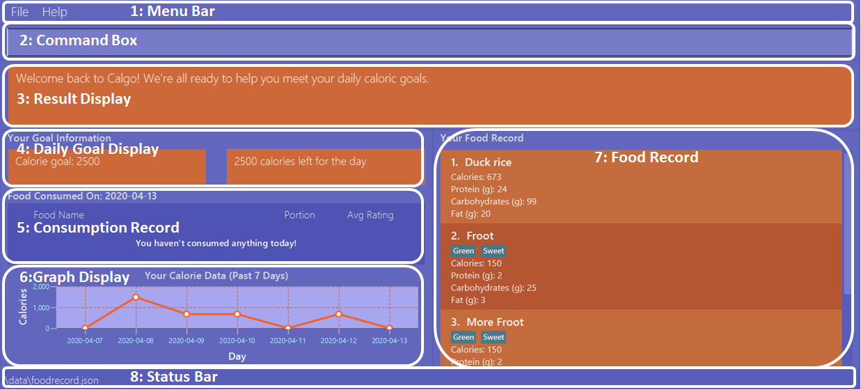
Calgo’s GUI is designed to be sleek and compact, allowing you to use and view all of Calgo’s features on a single window. However, that might be a little overwhelming at the start. Hence, this section aims to give a rundown on the GUI’s various parts and ease you into using the App, starting from the top of the GUI shown in the above diagram.
These sections are labelled from 1 to 8, in the following order:
-
Menu Bar -
Command Box -
Result Display -
Daily Goal Display -
Consumption Record -
Graph Display -
Food Record -
Status Bar
There is a ninth part, the Help Window, that is a separate pop up - only appearing when required for your convenience.
Menu Bar
The bar has two buttons, File and Help. The buttons allow
you to exit the App by clicking the exit option under File, and to access the command guide by clicking the
help option under Help. These buttons are there for your convenience, as exiting the app can also be done through the
exit command. Likewise, accessing the command guides can be done using the help command.
Command Box
Calgo listens to your requests and processes them. The Command Box is where you type commands into.
Should you mistype a command, Calgo will prompt you to use the right format. You can easily edit the wrong command
inside the Command Box without needing to retype it entirely.
Result Display
This is where Calgo displays textual updates as a result of processing your inputted commands. The Result Display will
always show a response so you will know whether your commands have been correctly processed.
Daily Goal Consumption
This section is labelled "Your Goal Information" on the GUI, and consists of two parts. The left box
displays your target daily calorie goal (after you’ve set it using the goal command). The right box shows
the amount of calories you still need to consume to meet your daily goal, or the amount you’ve exceeded by.
The Daily Goal Consumption updates automatically.
Consumption Record
The Consumption Record displays the list of Food entries that you have consumed on that day. Although it only shows
one day’s consumption, the stomach command lets you view other days' records.
It has three subsections:
-
The name of the
Foodentry. -
The number of portions of the
Foodyou consumed that day. -
The average rating as set by you, color-coded from red to green for low to high rating.
Graph Display
This section contains a graph that shows a summary of your past seven day’s total calorie consumption. It displays data
starting from the date of the current Consumption Record.
Example: Consumption Record currently shows 2020-04-12. Graph Display will thus show the daily calories consumed from
2020-04-06 to 2020-04-12.
Food Record
This is a list of all Food entries you currently have in Calgo. Each Food entry will have a name, its nutritional
information, and optional tags as set by you. The Food Record alternates colors between entries so that you
can easily tell one entry apart from its neighbours.
Status Bar
This bar shows where Calgo reads system data from. You should not delete or modify these files.
help : Displaying help when lost
(by Janice)
Whether you are an experienced Calgo user or a newcomer to the App, it can be hard to remember what a command’s usage and format
is. Thus, the help command aims to remind you of them.
Here are some key pointers:
Format: help [COMMAND_WORD]
Example:
Let’s say you’ve forgotten how to add Food entries to your Consumption Record. You know there is a command called nom,
but don’t recall its format. You can use the help command to obtain the format like so:
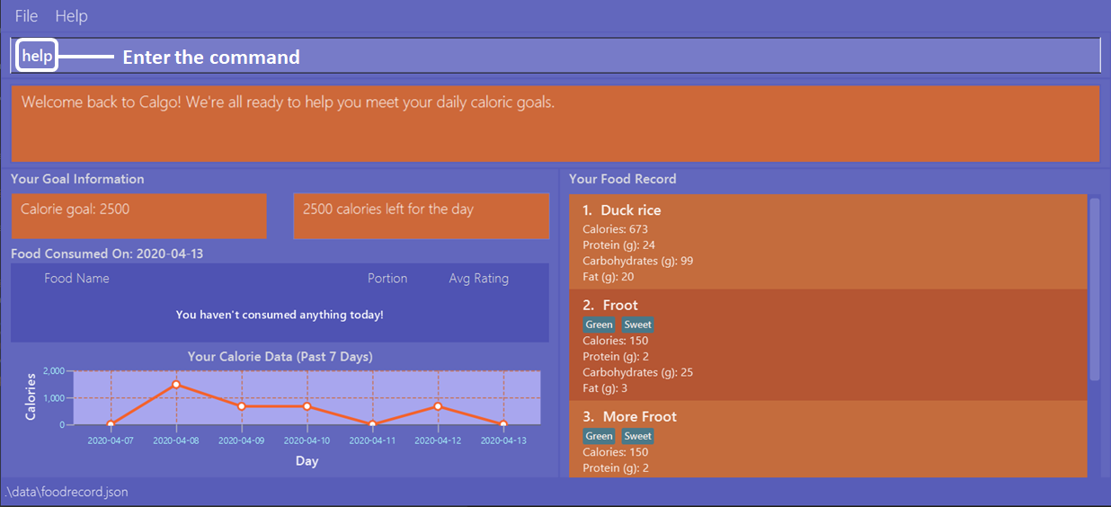
Type help, then press enter.
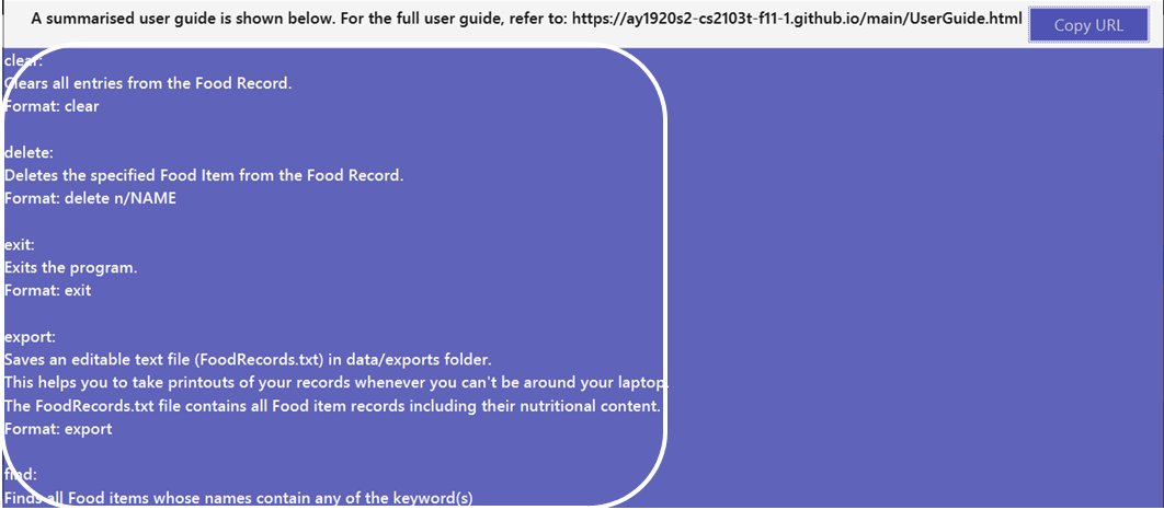
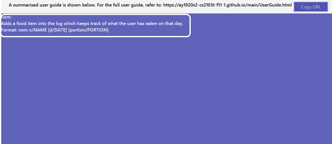
This creates a popup (the Help Window) with command guides. However that displays all the commands, which might make searching for only
nom a bit daunting. Instead, you can type help nom, then press enter.
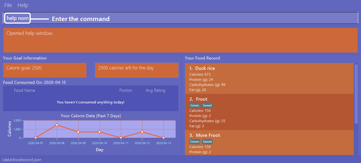
As you can see, the Help Window popup now only shows the command guide for nom.
Contributions to the Developer Guide
Given below are sections I contributed to the Developer Guide. They showcase my ability to write technical documentation and the technical depth of my contributions to the project. Please note that some hyperlinks may not work as the guide is not part of this portfolio. |
Past seven days calorie data graph
(by Janice)
This section addresses how the graph displaying the user’s past seven day’s daily total calorie consumption works.
Note that the graph counts starting from the date on the current Food Record, and the six days prior to it.
The graph will always display the past seven days' data at the bottom of the app, and will update whenever app data is changed.
If a command changes the date of the Food Record (such as nom or stomach), the graph will update to show data
for the past seven days from that date, inclusive.
|
Implementation
GraphPanel in the Ui component. It contains a LineChart of String date against Number calories, and is populated with
data from an XYChart.series. The data is in turn obtained from the Logic component, which provides only the past seven days'
of DailyFoodLog. The implementation of the GraphPanel class will be further explained.
GraphPanel class implements the following operations:
-
initialiseTreeMap- Sets up the TreeMap that mapsLocalDatedate ofDailyFoodLogto theDoubletotal calorie consumption n that day. -
initialseGraph- Sets up theLineChartwith xAxis aStringrepresenting date, and yAxis aDoublerepresenting total calories consumed on that date. -
updateSeries- Ensures theXYChart.seriesthat populates the graph with data is always updated with the most recent app data. -
makeGraph- Wrapper function that calls the above three methods. -
getGraph- Public accessor function to generate and retrieve theLineChart.
Calgo will display the past seven days' graph automatically, and likewise update automatically. It does so by having the
MainWindow class call getGraph on startup and after execution of commands.
The sequence diagram below demonstrates how the Graph feature works.

Sequence Diagram for Graph feature.
Step 1: MainWindow requests for an instance of GraphPanel.
If no instance exists, a new GraphPanel is created. Otherwise one is retrieved. This ensures that GraphPanel
is a singleton.
Step 2: MainWindow calls GraphPanel again to generate the graph and add it to the GraphPanelPlaceholder inside MainWindow.
Step 3: Inside GraphPanel, a wrapper method makeGraph calls three methods in a row:
First, initialiseTreeMap, which has Logic call the getPastWeekLogs method onto GraphPanel, generating
a TreeMap of String date mapped to Double calories using the past seven days' DailyFoodLog.
Second, initialiseGraph method is called to generate the graph itself.
Third, updateSeries method is called to ensure the data populating the graph is up to date.
After which, the GraphPanel adds the graph to MainWindow.
Design considerations
Aspect: Choice of visuals for past seven days summary
-
Alternative 1 (current choice): Summary is represented using a line graph.
-
Alternative 2: Summary is represented in a table.
Aspect: When graph’s dates are based on
-
Alternative 1 (current choice): Dates are based on past seven days starting from date of
Consumption Record, inclusive. -
Alternative 2: Dates are based on past seven days starting from today’s date, inclusive.
Summary
In summary, this section addresses how the graph obtains information on the past seven DailyFoodLog, and correspondingly
produces a visual graph output onto Calgo’s Main Window GUI component viewable by the user.
The graph requires the LogicManager class to obtain the information, and the MainWindow class to facilitate display
to the user.